In the article we have collect24 responsive layout that using jquery plugins. These plugins automatic adjust image and grid layout to fit the screen size in difference devices such tablets, to smartphones to desktop computers.
1. enquire.js
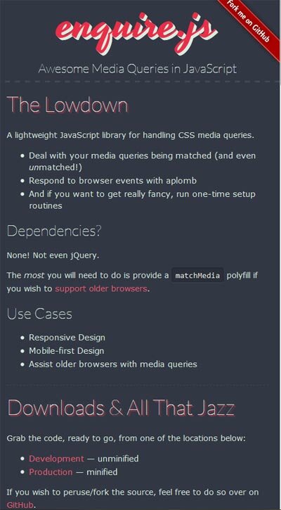
A lightweight JavaScript library for handling CSS media queries: Deal with your media queries being matched (and even unmatched!), Respond to browser events with aplomb ,And if you want to get really fancy, run one-time setup routines
2.responsive
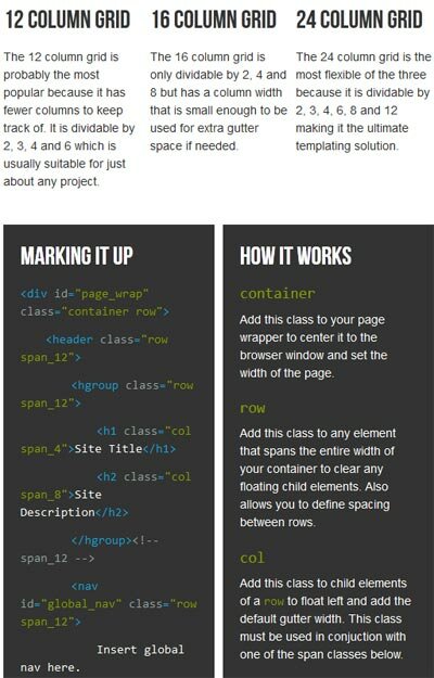
Fluid grid CSS framework for fast, intuitive development of responsive websites. Available in 12, 16 and 24 columns with media queries for all standard devices, clearfix, and optional reset.
3. amazium
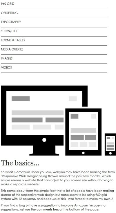
So what is Amazium I hear you ask, well you may have been hearing the term “Responsive Web Design” being thrown around the past few months, which simple means a website that can adjust to your screen size without having to make a separate website!
4. BluCSS
BluCSS is a CSS framework designed with ease of use and simplicity in mind. It is specifically made so that when you’re working on your next project, you don’t have to worry about the essentials. With BluCSS, you can be up and running in less than a minute
5. Wireframing
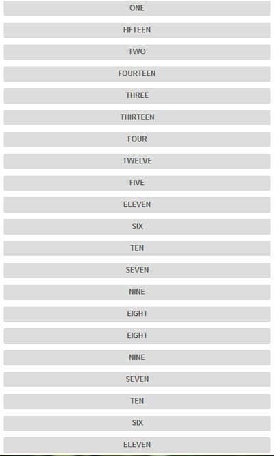
Wirefy is a collection of CSS & JS files to help you rapidly experiment with responsive wireframes. Whether you keep them to yourself or use them to help educate your clients, Wirefy is flexible and here to help. Wirefy has been built from the ground up. Following the philosophy of mobile first, Wirefy will respond to the proper viewport. Go ahead, resize this page to see how it works. Wirefy is style agnostic so that clients don’t get hung up on colours, fonts, other design elements. It’s meant to be another tool for your development kit that provides the most basic styles as a foundation.
6. Responsive Grid System
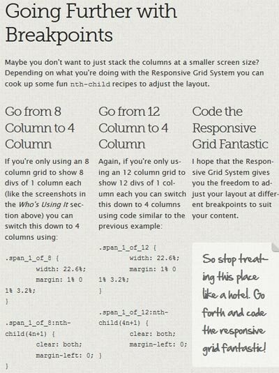
The Responsive Grid System isn’t a framework. It’s not a boilerplate either. It’s a quick, easy & flexible way to create a responsive web site.
7. jQuery Picture
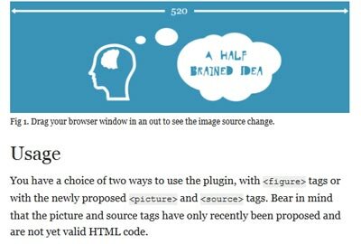
jQuery Picture is a tiny (2kb) plugin to add support for responsive images to your layouts. It supports both figure elements with some custom data attributes and the new proposed picture format. This plugin will be made redundant when the format is approved and implemented by browsers. Lets hope that happens soon but in the meantime this plugin will be kept up to date with latest developments.
8. ResponsiveAeon
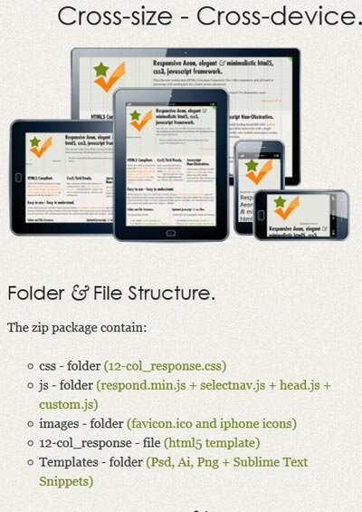
This page was created using the framework as it is, no extra class was added in mediaqueries. The framework has just over 120 lines of code, a little short for a framework but very useful for projects from scratch. We find that the less you worry about the basics you gain more time in development. *Tested in the most recent browsers.
9. responsify
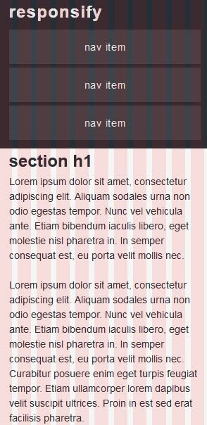
Quickly and effortlessly generate your own responsive grid template.
10. gumbyframework
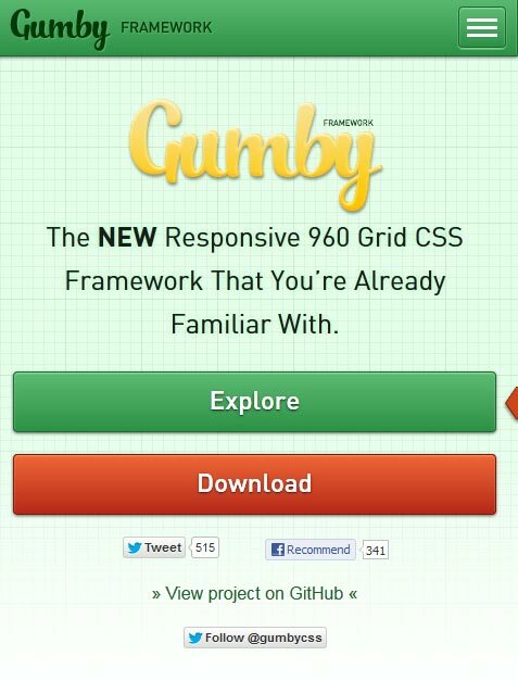
The Grid lets you lay out pages quickly and easily in a natural, logical way. The Gumby Framework’s grid system can be customized and molded to fit your every need — it’s easily adapted to any screen size or application. The possibilities are endless; the results are extraordinary.
11. responsejs
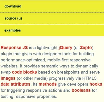
Response JS is a lightweight jQuery (or Zepto) plugin that gives web designers tools for building performance-optimized, mobile-first responsive websites. It provides semantic ways to dynamically swap code blocks based on breakpoints and serve images (or other media) progressively via HTML5 data attributes. Its methods give developers hooks for triggering responsive actions and booleans for testing responsive properties.
12. Foundation 3
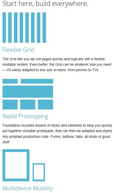
The Grid lets you quickly put together page layouts for mobile devices and the desktop. You don’t need two different sites — the Grid is built to create a rock-solid experience on all kinds of devices with the exact same markup
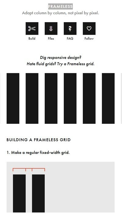
13. Frameless
14.SimpleGrid
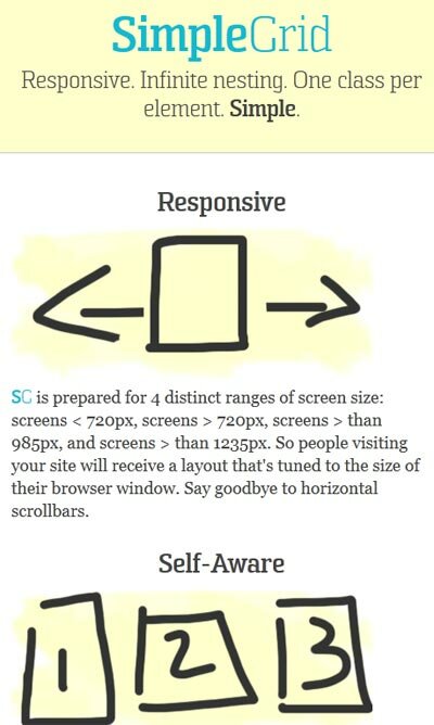
Responsive. Infinite nesting. One class per element. Simple.
15. Golden Grid System
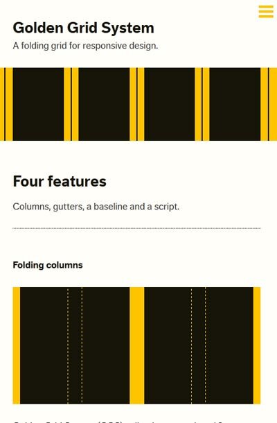
Golden Grid System (GGS) splits the screen into 18 even columns. The leftmost and rightmost columns are used as the outer margins of the grid, which leaves 16 columns for use in design.
16. twitter Bootstrap

Sleek, intuitive, and powerful front-end framework for faster and easier web development.
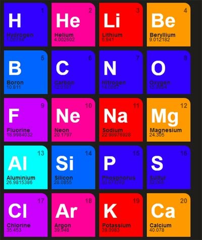
17.Isotope
18. jQuery responsive slider
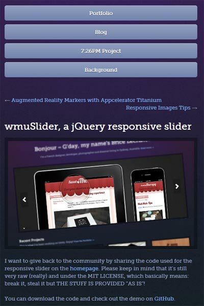
I want to give back to the community by sharing the code used for the responsive slider on the homepage. Please keep in mind that it’s still very raw (really) and under the MIT LICENSE, which basically means: break it, steal it but THE STUFF IS PROVIDED “AS IS”!
19. Responsly.js
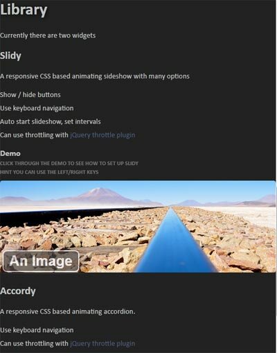
Responsive designs are cool! Not only do they allow you to reach mobile and tablet users with minimal effort, they also make your context scale up for desktop users with larger screens.
20. jQuery Masonry
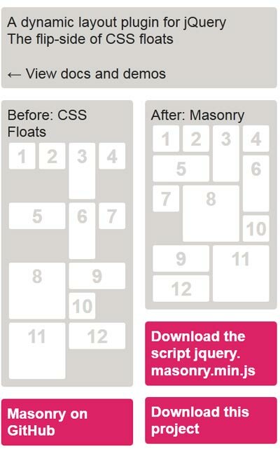
A dynamic layout plugin for jQuery The flip-side of CSS floats
21. jquery responsive web

it is a simple jquery plugin helping design more responsive and adaptive websites and web applications with almost no setup.
22. jquery-quickfit
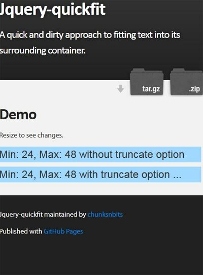
A quick and dirty approach to fitting text into its surrounding container.
23. The Heads-Up Grid
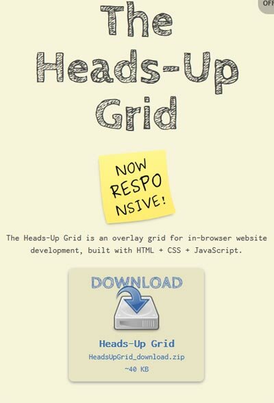
The Heads-Up Grid is an overlay grid for in-browser website development, built with HTML + CSS + JavaScript.
24. Hoverizr
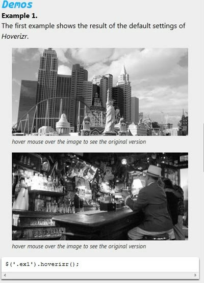
Hoverizr is a really small (2.5KB minified) responsive jQuery plugin that outputs manipulated images on top (or below) your targeted images. Currently, it features three effects: grayscale, blur and color inversion. Automatically when you move your mouse over the target elements, the element above fades out to reveal the element beneath whether it is the original image or the manipulated one.
